


Introduction:
In today’s digital realm, where smartphones and tablets have become extensions of our daily lives, the way we experience the web has undergone a profound transformation. With a significant shift towards mobile browsing, businesses and website creators are compelled to rethink their approach to design and user experience.
Enter mobile-first design – a philosophy that challenges conventional web design practices by prioritizing the mobile user experience above all else. At its core, mobile design advocates for starting the design process with mobile devices in mind, and then progressively enhancing the experience for larger screens.
As the digital landscape continues to evolve, understanding the impact of mobile design on user experience (UX) is not just advantageous but imperative for businesses striving to stay relevant and competitive in an increasingly mobile-centric world.
In this blog post, we’ll explore the intricacies of mobile design and its profound implications for user experience. From responsive web design to mobile optimization and beyond, we’ll delve into the key principles and strategies that underpin effective mobile design, all while keeping our focus squarely on enhancing the user experience.
But before we dive into the nitty-gritty details, it’s essential to grasp the essence of mobile design and why it’s more than just a passing trend. Let’s embark on a journey to unravel the mysteries and unveil the transformative power of mobile design in shaping the digital experiences of tomorrow.
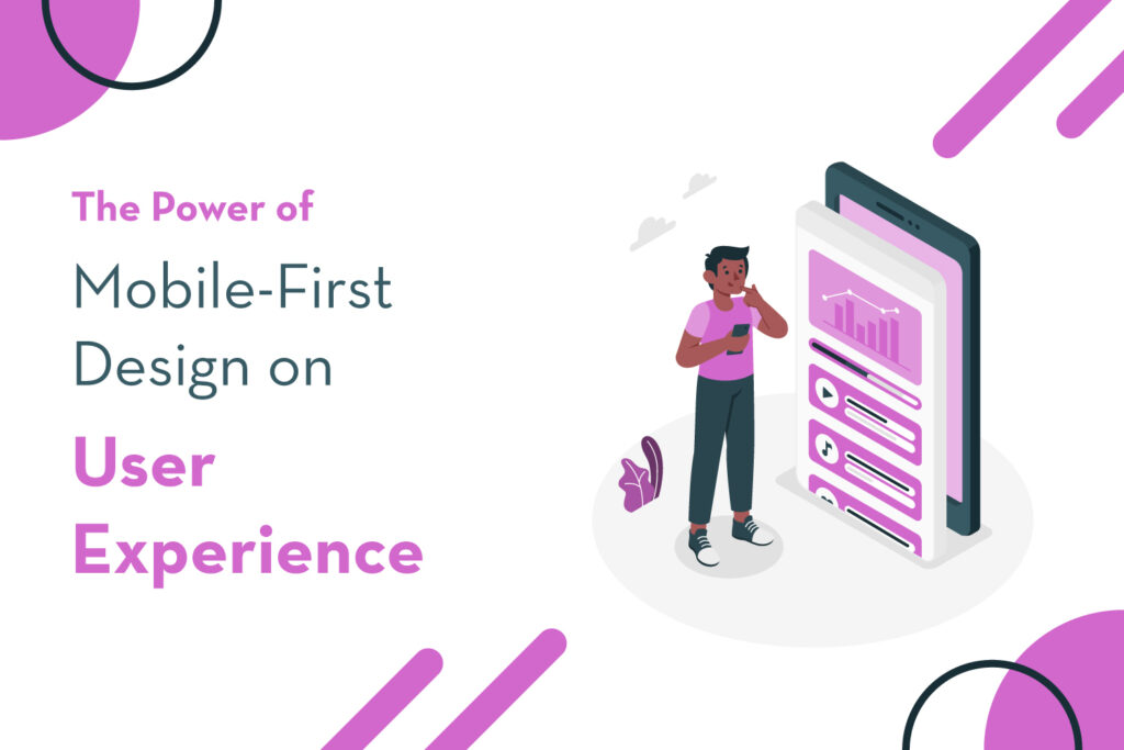
What is Mobile-First Design?
Mobile-first design is a revolutionary approach to web design that prioritizes the mobile user experience. Unlike traditional methods that focus on desktop layouts first, mobile design begins with the smallest screen size – that of smartphones – and then scales up to larger screens.
The shift towards mobile-first design is driven by the exponential growth in mobile device usage. By putting mobile users at the forefront, designers create streamlined and intuitive experiences tailored to the unique needs of mobile users.
Simplicity and clarity are central to mobile-first design. Designers prioritize essential elements for mobile users, ensuring faster load times and smoother navigation. This approach also fosters accessibility, making content available to all users, regardless of their device or ability.
Mobile-first design isn’t just about aesthetics; it’s about performance and accessibility. By optimizing websites for mobile devices, businesses can create seamless experiences that resonate with users across various platforms.
Enhancing User Experience Through Mobile-First Design:
The mobile-first design puts the needs and preferences of mobile users at the forefront. It ensures that websites are optimized for smaller screens, touch gestures, and varying network conditions. By adopting responsive layouts and flexible designs, mobilewebsites adapt to the user’s device, providing a consistent and intuitive experience. This approach enhances user engagement, reduces bounce rates, and improves overall satisfaction with the website.
Impact on Website Performance and Engagement:
Mobile-first design not only enhances user experience but also has a significant impact on website performance and engagement. Mobile-friendly websites load faster, which is crucial for retaining impatient mobile users. Studies have shown that users are more likely to abandon a website if it takes too long to load on their mobile device. By optimizing for mobile-first design principles, websites can improve performance metrics such as page load times, bounce rates, and conversion rates.
Accessibility and Inclusivity:
Another important aspect of mobile-first design is its focus on accessibility and inclusivity. By prioritizing mobile users, designers are forced to consider the needs of users with disabilities or limitations. Mobile-friendly websites incorporate features such as larger fonts, clear navigation menus, and alternative text for images, making the content more accessible to a wider audience.
Challenges and Considerations:
While mobile-first design offers numerous benefits, it also presents challenges for designers and developers. One of the primary challenges is ensuring compatibility across different devices, operating systems, and screen sizes. Designers must also consider the limitations of mobile devices, such as smaller screen real estate and slower processing speeds. However, with careful planning and testing, these challenges can be overcome to create optimal mobile experiences.
Future Trends and Considerations:
As technology continues to evolve, so too will the principles and practices of mobile-first design. Emerging trends such as progressive web apps (PWAs), accelerated mobile pages (AMP), and voice search optimization are reshaping the landscape of mobile design. Designers must stay informed about these trends and adapt their strategies accordingly to remain competitive in the mobile space.
Conclusion:
In summary, mobile-first design represents a fundamental shift in how we approach online design and user experience, not merely a fad. By prioritizing mobile users and creating mobile-friendly websites, businesses can effectively reach and engage with their target audience. As mobile usage continues to rise, investing in mobile-first design is essential for staying relevant and competitive in today’s digital marketplace.


